TL;DR
| The challenge | WooCommerce merchants were abandoning subscription setup after hours of failure. Existing tools required developer-level knowledge to do something merchants expected to take minutes. |
| My role | Product Designer - research, strategy, interaction design, usability testing, launch |
| Team | 1 PM, 3 Engineers, 1 Marketing Lead |
| Timeline | 6 months, Aug 2024 - Jan 2025 |
| Concurrency | Ran alongside Cart during Q4 2024–Q1 2025 |
| Tools | Figma, Maze, Hotjar, Amplitude |
The challenge
WooCommerce merchants were abandoning subscription setup after hours of failure. Existing tools required developer-level knowledge to do something merchants expected to take minutes.
My role
Product Designer - research, strategy, interaction design, usability testing, launch
Team
1 PM, 3 Engineers, 1 Marketing Lead
Timeline
6 months, Aug 2024 - Jan 2025
Concurrency
Ran alongside Cart during Q4 2024–Q1 2025
Tools
Figma, Maze, Hotjar, Amplitude
Key Design Decisions
I watched a merchant spend 6 hours trying to set up monthly tea deliveries. The plugin had every feature she needed - it just spoke a completely different language.
1,000+ installs in 90 days. Setup time down from 6 hours to 4 minutes. 94% of merchants completing setup without filing a support ticket. The company's previous product took 6 months to hit those install numbers. Here's how it happened.
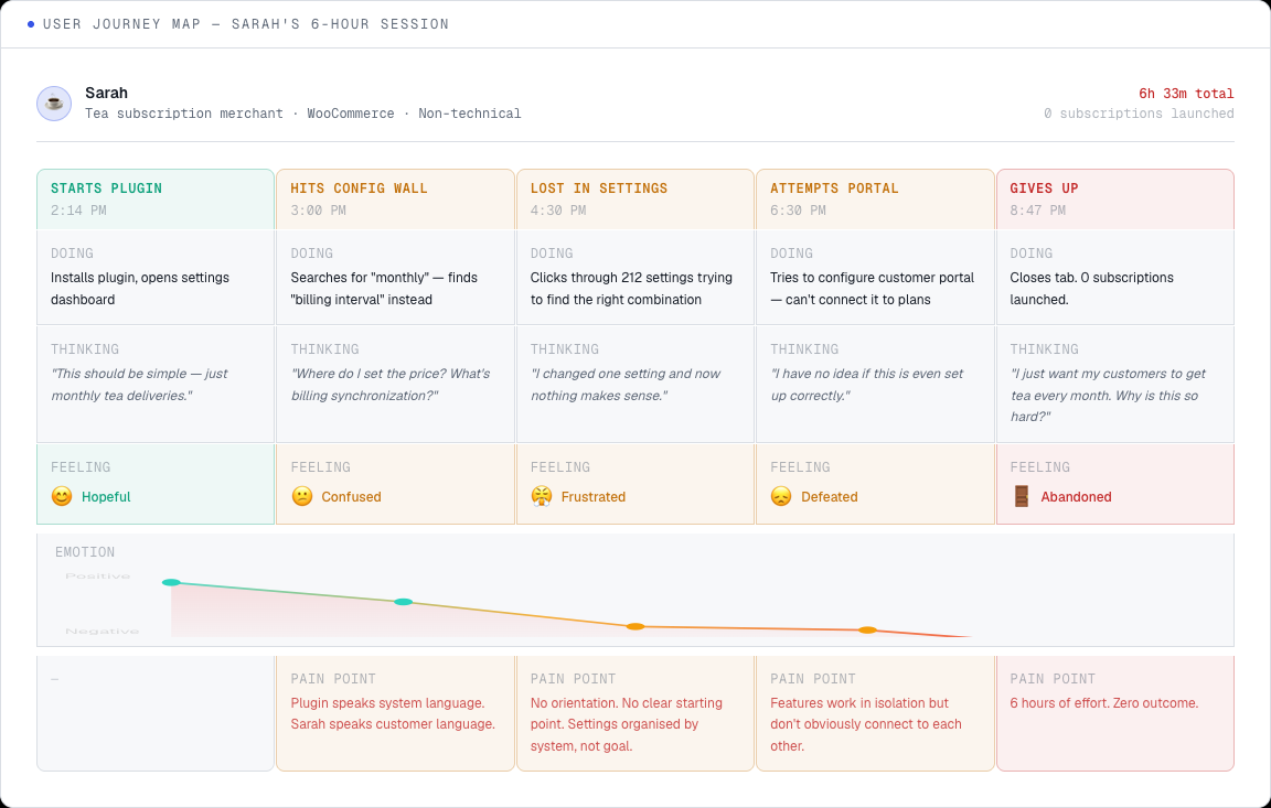
This project started with a Hotjar recording. Sarah, a tea subscription merchant, spent 6 hours trying to do something that should take a few minutes. She wasn't confused because she couldn't figure things out. She was confused because the tool was built for developers, and she thinks in terms of "customers get tea every month."
Watching Sarah Fail
Sarah
Tea subscription merchant · WooCommerce · Non-technical sole proprietor
6h 33m · 0 subscriptions
Saturday afternoon session
Starts Plugin
Hits Config Wall
Lost in Settings
Attempts Portal
Gives Up
Actions
Installs plugin, opens settings dashboard
Actions
Searches 'monthly' - finds 'billing interval' instead. Clicks around 40+ settings.
Actions
Clicks through 212 settings trying every combination for 90+ minutes.
Actions
Tries to configure customer portal - cannot connect it to subscription plans.
Actions
Closes tab after 6h 33min. Zero subscriptions launched.
Saying
“This should be simple - just monthly tea deliveries.”
Saying
“Where do I set the price? What is billing synchronization?”
Saying
“I changed one setting and now nothing makes sense.”
Saying
“I have no idea if this is even set up correctly.”
Saying
“I just want my customers to get tea every month. Why is this so hard?”
Thinking
Finally found a plugin that promises subscription management!
Thinking
Am I in the right section? This doesn't look like where subscriptions go.
Thinking
Maybe I need a developer for this. This is too complex.
Thinking
What's the point of a customer portal if it can't see my plans?
Thinking
I'll just email customers manually. This plugin isn't for people like me.
Emotion Arc
Opportunity
→ Clear onboarding that maps to merchant goals
Opportunity
⚠ Plugin speaks system language. Sarah speaks customer language.
→ Plain-language labels matching merchant vocabulary
Opportunity
⚠ No orientation. Settings organised by system, not by merchant goal.
→ Goal-first setup wizard that hides irrelevant settings
Opportunity
⚠ Features work in isolation. No obvious connection between Plan Library and Portal.
→ Two-tier architecture: Plans → Products → Portal (unified)
Opportunity
⚠ 6 hours of effort. Zero outcome. Cannot recommend to peers.
→ Recovery path: save progress, guided return, success guarantee
Starts Plugin
😊 Hopeful
Installs plugin, opens settings dashboard
“This should be simple - just monthly tea deliveries.”
→ Clear onboarding that maps to merchant goals
Hits Config Wall
😕 Confused
Searches 'monthly' - finds 'billing interval' instead. Clicks around 40+ settings.
“Where do I set the price? What is billing synchronization?”
⚠ Plugin speaks system language. Sarah speaks customer language.
→ Plain-language labels matching merchant vocabulary
Lost in Settings
😤 Frustrated
Clicks through 212 settings trying every combination for 90+ minutes.
“I changed one setting and now nothing makes sense.”
⚠ No orientation. Settings organised by system, not by merchant goal.
→ Goal-first setup wizard that hides irrelevant settings
Attempts Portal
😞 Defeated
Tries to configure customer portal - cannot connect it to subscription plans.
“I have no idea if this is even set up correctly.”
⚠ Features work in isolation. No obvious connection between Plan Library and Portal.
→ Two-tier architecture: Plans → Products → Portal (unified)
Gives Up
😔 Abandoned
Closes tab after 6h 33min. Zero subscriptions launched.
“I just want my customers to get tea every month. Why is this so hard?”
⚠ 6 hours of effort. Zero outcome. Cannot recommend to peers.
→ Recovery path: save progress, guided return, success guarantee
I watched Sarah's recording on a Saturday afternoon. She started at 2:14 PM. By 8:47 PM she'd closed the tab. Six hours. Zero subscriptions launched.
"I just want customers to get tea every month. Why do I need to understand billing synchronization?"
That quote became the north star. I recruited from the company's support ticket backlog - merchants who'd filed subscription-related tickets in the previous 3 months. 11 agreed to recorded sessions. Every session looked the same: long stretches of confusion followed by giving up. Merchants think in outcomes - "deliver coffee monthly with 10% off." Plugins demand system fluency - "create a variable product with 30-day billing intervals, configure a subscription coupon with renewal conditions."
The company had 50,000 WooCommerce merchants on its checkout tools. Support data kept surfacing the same pattern: merchants trying and failing to add subscriptions. 32% searched for "subscription" in docs within their first week. Most never made it.
The Competitive Landscape
I coded 847 support tickets from the previous 6 months alongside 12 user interviews. The market leader at $199/year was capable but built for developers. Shopify's native subscription setup takes under 3 minutes - but you need the Shopify ecosystem. WooCommerce merchants had nothing comparable.
I installed every major competitor and ran identical setup tasks:
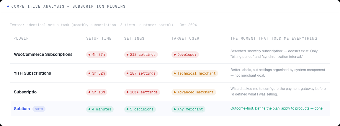
Why Better Labels Weren't Enough
First-Touch Failure
71%of failures within first 20 min
847 support tickets + 12 interviews
“Where do I even start?”
“I clicked everything and nothing made sense”
“There's no obvious first step”
Insight
No orientation = immediate abandonment
Terminology Gap
58%of tickets mention unfamiliar terms
Coded from support ticket language
“What's billing synchronization?”
“Variable product? I sell candles.”
“'Interval' vs 'frequency' - same thing?”
Insight
Plugin language ≠ merchant language
Feature Isolation
44%said features felt disconnected
User interviews + session recordings
“I set up the plan but can't apply it to products”
“The portal doesn't know about my plans”
“Everything works separately but not together”
Insight
Need: unified two-tier architecture
Hypothesis Testing
5 merchants per variant
Better copy (relabelling only)
11% reduction in setup time
In-app help sidebar
14% reduction in setup time
Guided 5-step wizard
All complete, 8 min average
Two-tier architecture
4 min, 94% raised no ticket
The breakthrough observation
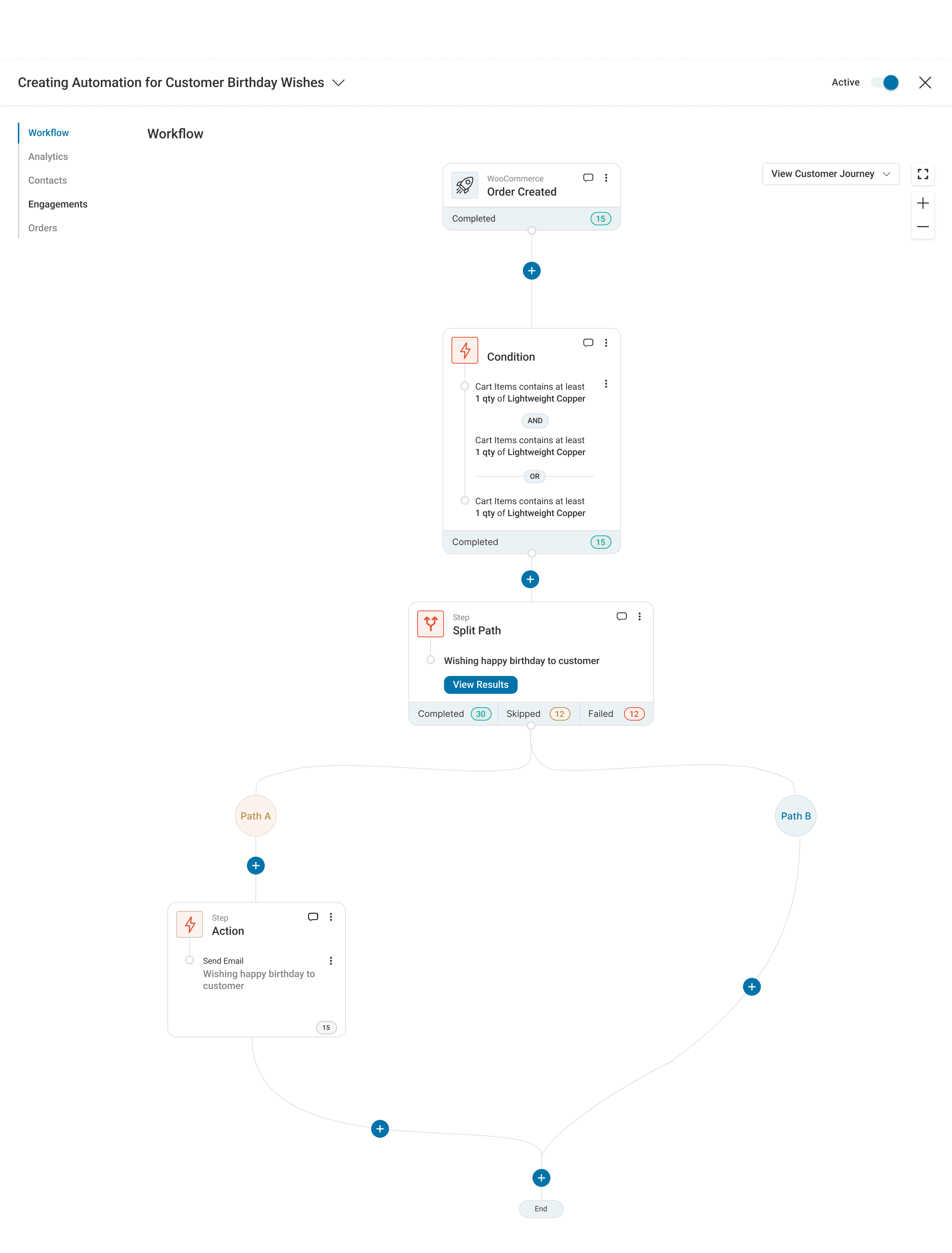
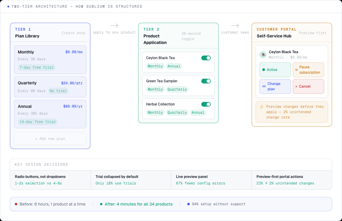
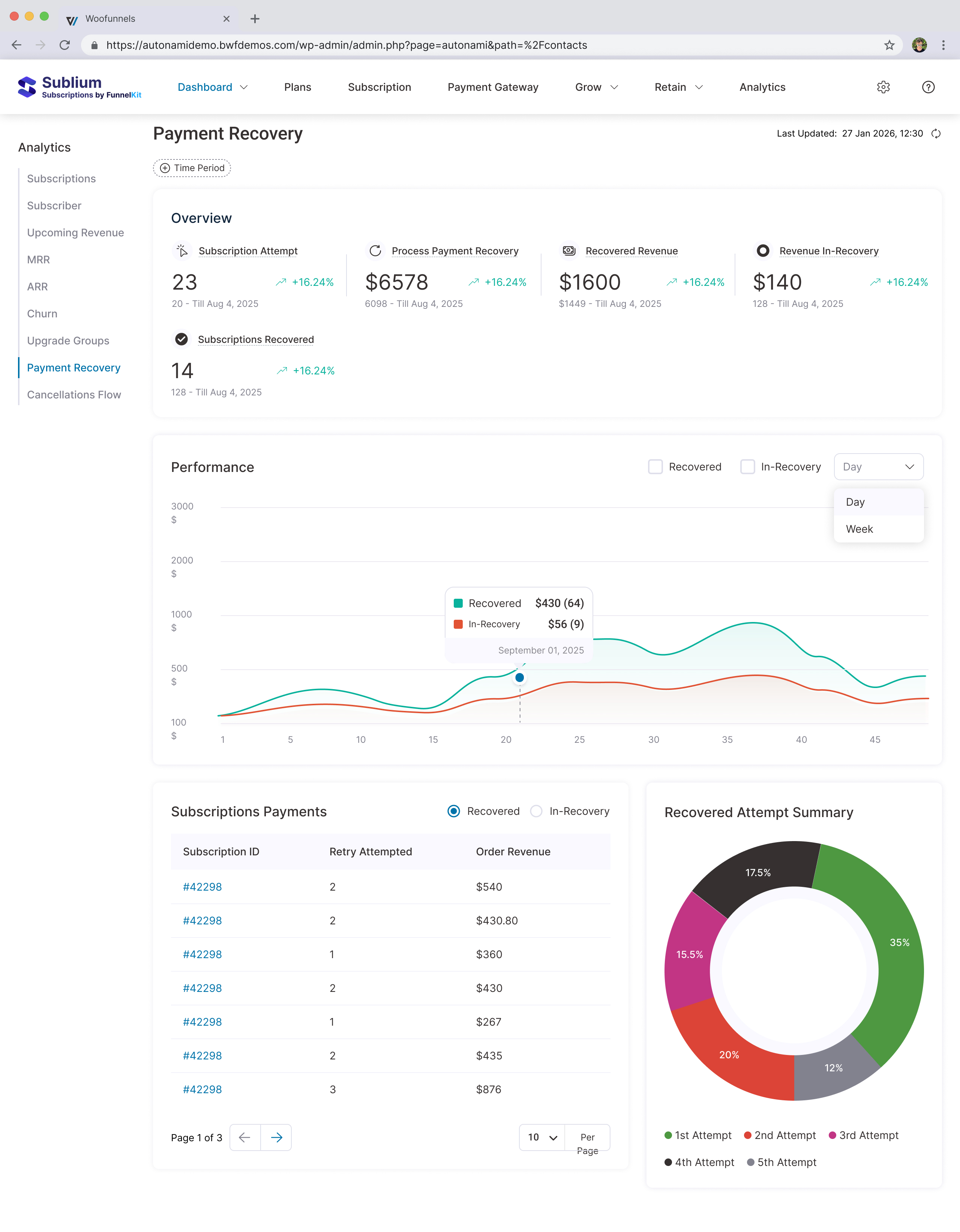
Merchants were not just setting up subscriptions - they were defining options first (monthly, quarterly, annual), then applying them to products. Two separate activities. The plugin treated them as one. Separating into a two-tier architecture dropped setup from 4–6 hours down to 4 minutes.
Two rounds of affinity mapping. I expected failures spread across setup steps. Instead, 71% of breakdowns clustered in the first 20 minutes - before anyone even reached pricing or trial configuration. Merchants couldn't establish basic orientation.
I stress-tested three explanations: poor copy, missing documentation, mental model mismatch. Prototyped fixes for each, tested with 5 merchants per variant. Better copy cut setup time by 11%. An in-app help sidebar: 14%. Only the mental model reframe produced a real step change.
A guided five-step wizard: all 8 participants completed setup in 8 minutes. Then I asked them to go back and change one setting. The wizard forced them through all five steps again. "This is great the first time, but now it's in my way." Wizards optimise for first use and penalise everything after.
Relabelling alone - "30-day billing interval" became "Monthly" - dropped setup time to 2h 40m. Better, but still nearly 40x longer than the target. The labels were right. The structure underneath was still wrong.
The Architecture Breakthrough
It clicked during a research session. A merchant wasn't setting up one subscription - she was doing two separate things. First, defining her options (monthly, quarterly, annual). Then deciding which products each option applied to. Two distinct activities. Every plugin on the market treated them as one.
I checked this with the next 6 merchants. 5 of 6 described subscription options as a separate business decision from the product catalogue.
Two Tiers
That observation led straight to the architecture:
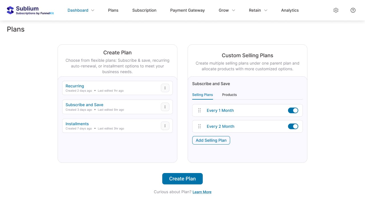
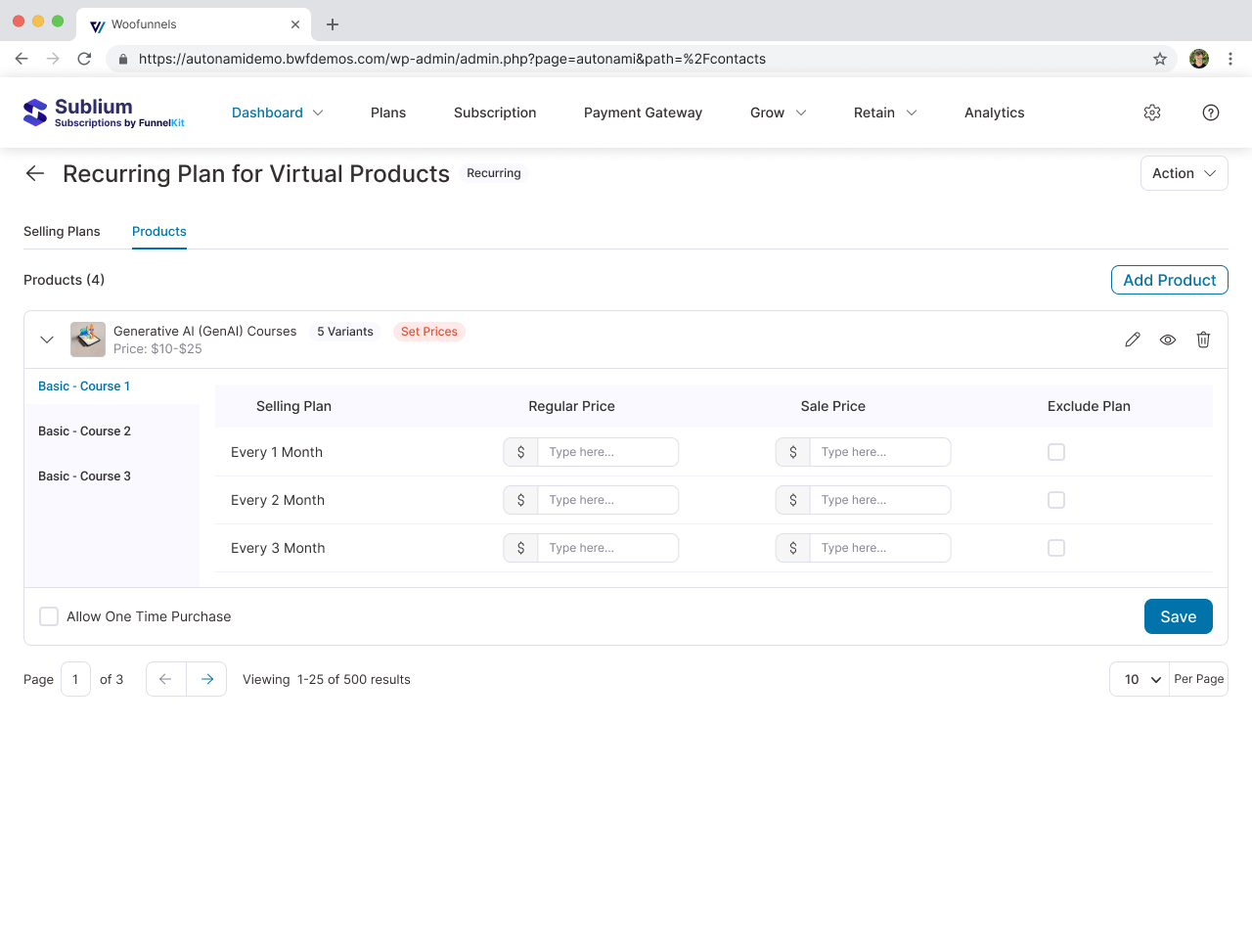
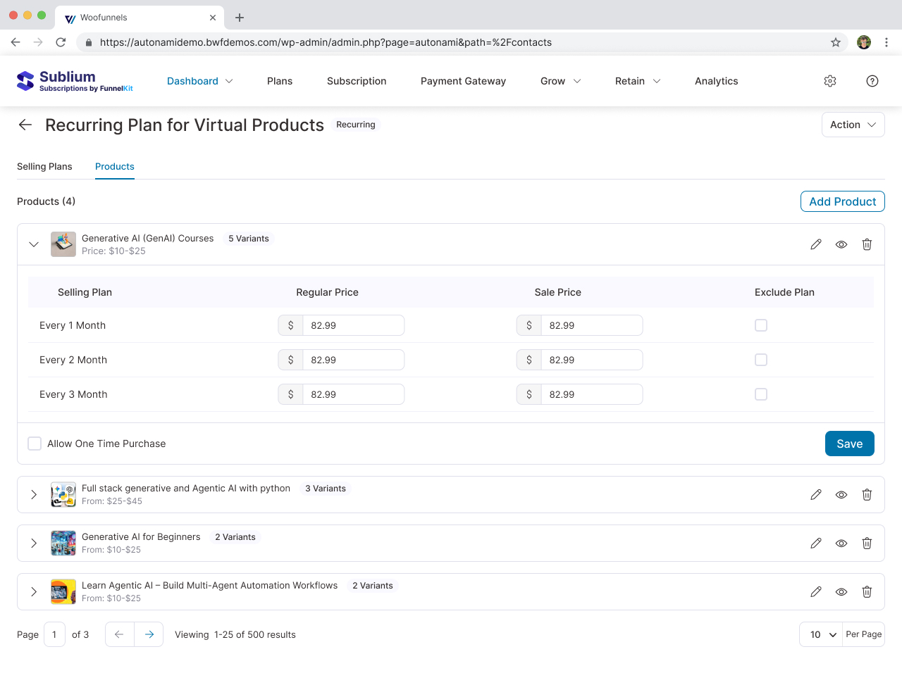
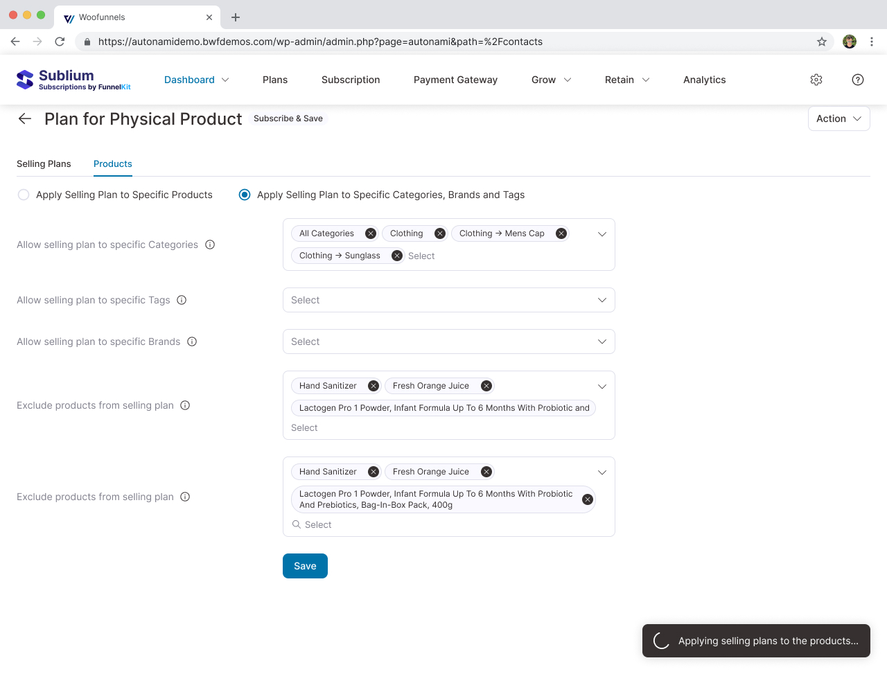
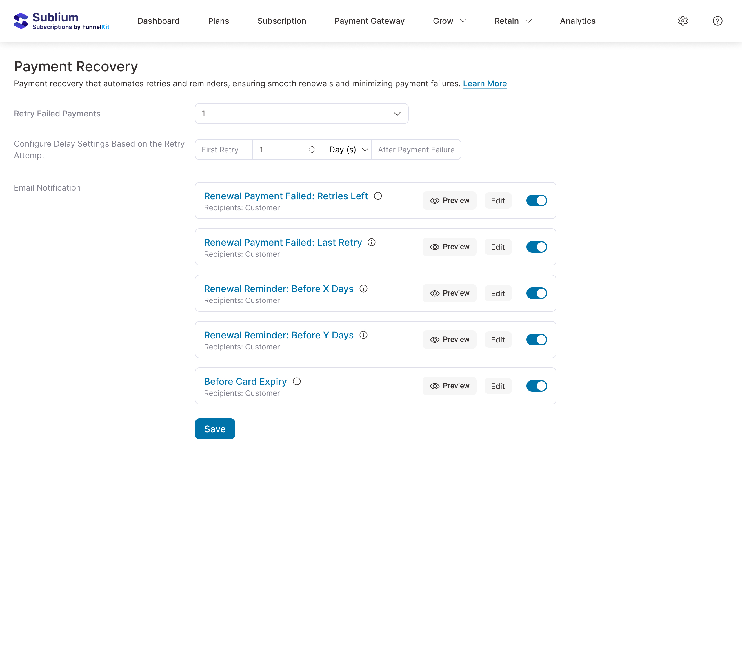
Tier 1 - Plan Library: Create reusable plans once. Edit a plan, changes cascade to every product using it.
Tier 2 - Product Application: On any product edit screen, one toggle. Select which plans apply. Done in 30 seconds.
Built a prototype in 3 days, tested with 8 merchants. All finished setup in under 5 minutes. Asked them to add subscriptions to a second product the next day - every one did it in under 30 seconds without any guidance. That two-tier split is why setup dropped from 6 hours to 4 minutes.
PM pushed back: "Merchants with only one product type won't need a plan library." I ran a stress-test on single-product merchants - even they created an average of 2.4 subscription tiers. The library was simpler in every case. That conversation also pushed me to document data more rigorously for stakeholder discussions, a habit I've kept since.
Design Details
Radio buttons over dropdowns for billing frequency. Dropdown users took 4-8 seconds, radio users 1-2. Small change, surprisingly big difference.
Trial period collapsed by default. Only 18% of subscriptions include trials. Showing trial options confused the 82% who didn't need them.
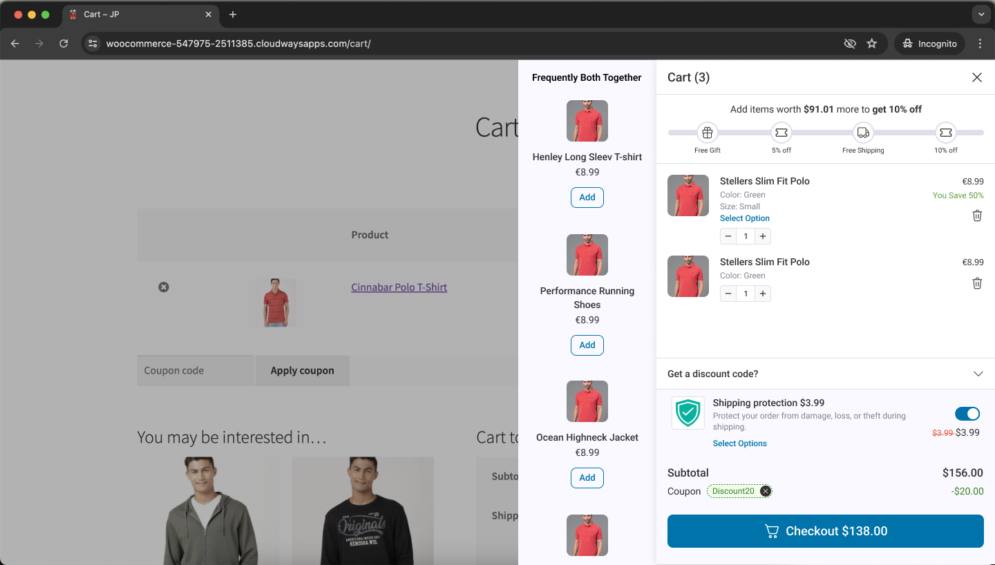
Customer portal. Tested action-first (pause immediately, confirm after) vs. preview-first (show what happens before committing). Action-first had a 23% "I didn't mean to do that" rate. Preview-first: 2%. The extra step wasn't friction - it was confidence.
Live preview panel. Merchants kept tabbing between settings and their live store to see changes. Real-time preview cut configuration errors by 67%.
Accessibility. I audited every competitor for keyboard support before wireframing. All had failures - radio groups not announced by screen readers, modals not trapping focus. I tested with VoiceOver during prototyping.
Engineering navigation. Lead engineer flagged that global plan management would add 12 weeks. I scoped V1 to ship product-level plans first using the same UI components, just pointing to a different data source. When global plans shipped later, merchants didn't need to relearn anything.
.jpg)
Reflections
I underestimated brand diversity. 45% of merchants wanted to change copy, colour, or positioning. A brand personality preset during setup would've solved this. I was so focused on simplifying the flow that I forgot - merchants have their own identity. Simplicity without personality feels generic.
I cut something merchants actually needed. A "subscription notes" field turned out to be the third most-requested feature after launch. I'd run it through my simplicity filter and removed it. But simplification shouldn't mean deleting things people genuinely use for their operations.
I tested the wrong segment. All my participants were merchants who'd failed at setup. I didn't test with merchants who had working subscriptions on competitors. Turns out migration friction was much higher than I'd expected - merchants with 500+ active subscribers weren't going to manually recreate their plans, no matter how much better the product was. That blind spot cost us early adoption from exactly the people we wanted most.
“I set up my first subscription in under 5 minutes. This is the first WooCommerce plugin that actually feels designed for humans.”
More Projects