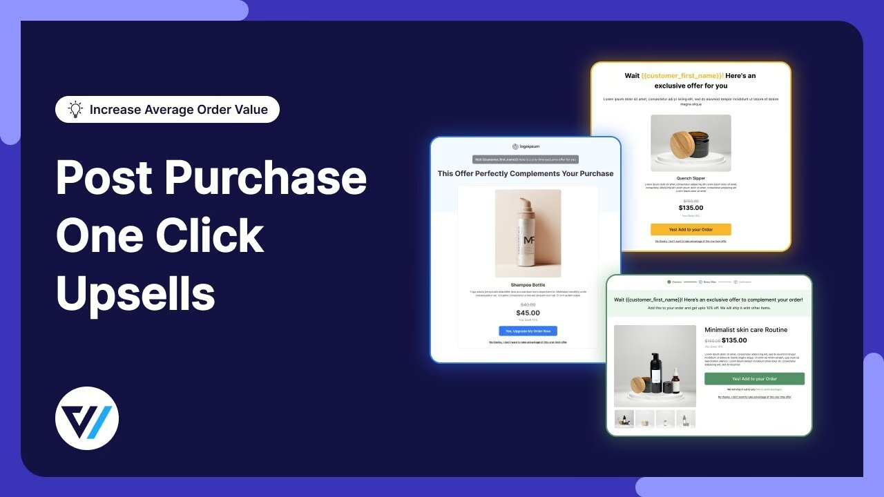
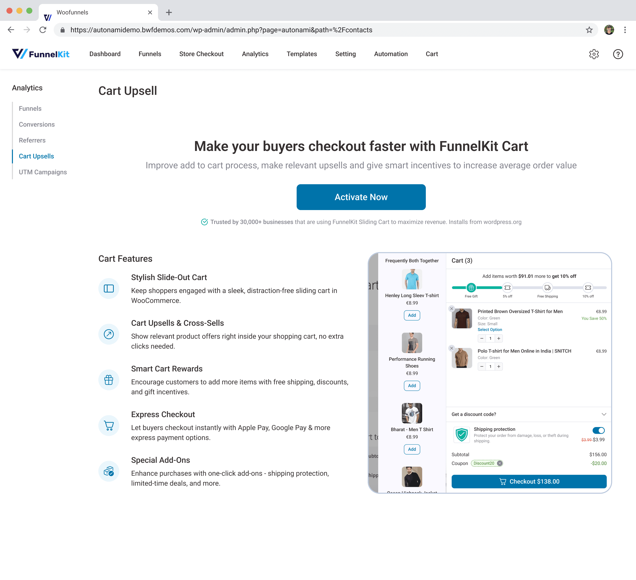
FunnelKit One-Click Upsells
31% acceptance rate through behavioural timing - rethinking post-purchase upsells
TL;DR
| The challenge | WooCommerce stores had no post-purchase strategy. Customers with payment saved and intent still active were leaving on a static thank-you page. Existing upsell plugins either killed conversion with friction or repelled customers with aggressive tactics. |
| My role | Product Designer - behavioural research, design strategy, A/B testing framework, ethical disclosure design |
| Team | 1 PM, 4 Engineers, 1 Data Analyst |
| Timeline | 7 months, March - Sept 2024 |
| Concurrency | Ran alongside Automations during Q2–Q3 2024 |
| Tools | Figma, Optimizely, Hotjar, Amplitude |
The challenge
WooCommerce stores had no post-purchase strategy. Customers with payment saved and intent still active were leaving on a static thank-you page. Existing upsell plugins either killed conversion with friction or repelled customers with aggressive tactics.
My role
Product Designer - behavioural research, design strategy, A/B testing framework, ethical disclosure design
Team
1 PM, 4 Engineers, 1 Data Analyst
Timeline
7 months, March - Sept 2024
Concurrency
Ran alongside Automations during Q2–Q3 2024
Tools
Figma, Optimizely, Hotjar, Amplitude
Key Design Decisions
Same customer. Same offer. Same design. Acceptance swung from 18% to 31% based on one variable - when we asked.
22,847 active installations. 31% average upsell acceptance. $47M in incremental revenue across merchants. We got there by proving that upsell success is about timing and framing, not about the product or the price. Here's how.
One thing first. We built a one-click upsell system that hit 31% acceptance. Then legal review required explicit charge disclosure before any one-click purchase. Acceptance dropped to 27%. We kept the disclosure. 27% with full transparency beats 31% with a trust risk. These are customers' credit cards - they should know exactly what they're agreeing to before they tap. That's a decision I'd make again.
No price disclosure
Your saved payment method will be charged.
Full transparency
4% conversion drop accepted for complete transparency
Ethical choiceThe Hypothesis
Those 30 seconds after a purchase are unlike anything else in e-commerce. Payment's saved. Intent is still high. Industry data puts post-purchase upsell acceptance at 25-35%. But 94% of WooCommerce stores just show a static thank-you page and call it done.
The existing options all had problems. One plugin required re-entering payment - conversion dropped to ~8%. Another was one-click but showed random products. A third had smart targeting but took 45 minutes to configure.
I built the project around one question: Is upsell acceptance mainly a timing and framing problem, not a product or pricing one?
Testing Timing
Recruited 30 shoppers from our beta merchant pool - customers who'd completed at least 2 purchases in the prior 90 days. Showed them the exact same upsell offer (same product, price, design) at different moments after checkout.
| When shown | Acceptance rate | What they said |
|---|---|---|
| 0-30 seconds | 18% | "I just spent $80. Now you want more? I'm done." |
| 3 seconds | 31% | "Oh, this would actually go perfectly with what I bought." |
| 5+ seconds | 19% | "I'd already moved on mentally." |
The difference between 18% and 31% was 3 seconds. I didn't believe it at first either. But the behavioural research backs it up - there's a post-decision consolidation window, a brief period where you shift from "did I make the right choice?" to "what else goes with this?" Three seconds catches that transition. Our data analyst validated against 500 beta transactions and the pattern held within 2 percentage points.
Spending Mode
18% acceptance
Still processing purchase
Validation Mode
31% acceptance
Receptive to complementary value
Moved On
19% acceptance
Mentally left the store
Same customer. Same offer. Same design.
Only timing changed.
Spending Mode
18% acceptance
Still processing purchase
Validation Mode
31% acceptance
Receptive to complementary value
Moved On
19% acceptance
Mentally left the store
Same customer. Same offer. Same design.
Only timing changed.
Testing Framing
50 participants across two rounds of 25:
| Framing | Acceptance |
|---|---|
| "Complete Your Order" | 31% |
| "You Might Also Like" | 24% |
| "Don't Miss This Deal" | 18% |
13 percentage points from word choice alone. "Complete Your Order" works because it activates a commitment frame - you've started something, here's the rest of it. "Don't Miss This Deal" triggers scarcity, which clashes with the relief people feel right after buying.
Both tests confirmed the hypothesis. Design target became clear: deliver something that feels like help at exactly the right moment. Worth noting - these were small samples (30-50 people), so I treated them as directional, not definitive. The beta merchant data at scale later confirmed the ranges.
What Competitors Got Wrong
I went through 500 post-purchase sessions on Hotjar and talked to 30 customers who'd declined upsell offers. The failures had consistent shapes.
Predatory framing kills trust - full-screen blocking pages with countdown timers that feel manipulative. Irrelevant offers are invisible - showing bestsellers regardless of what someone just bought. And any friction at the payment moment shatters the window.
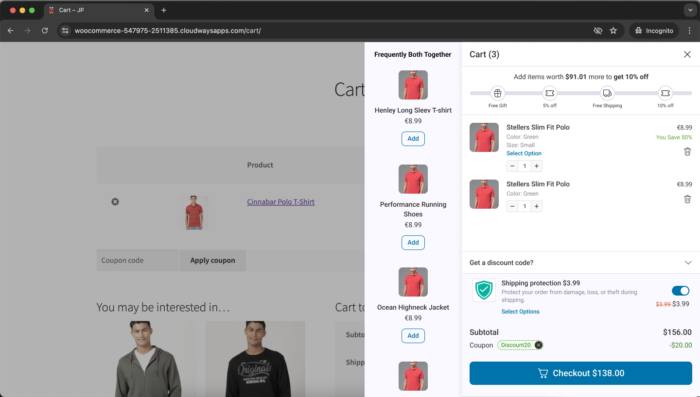
Amazon's "Frequently bought together" uses real co-purchase data with informational framing. Dollar Shave Club's "Complete your kit" positions additions as finishing something you started. Both feel helpful, not salesy. That was the bar.
Re-entry Required
~8% conversionRandom Offers
Yoga Mat
Jump Rope
Irrelevant pairing
Predatory Framing
WAIT! LAST CHANCE!
DON'T MISS OUT!
Trust destroyer
Amazon
Frequently bought together
Relevant + low pressure
Dollar Shave Club
Complete your kit
Natural extension
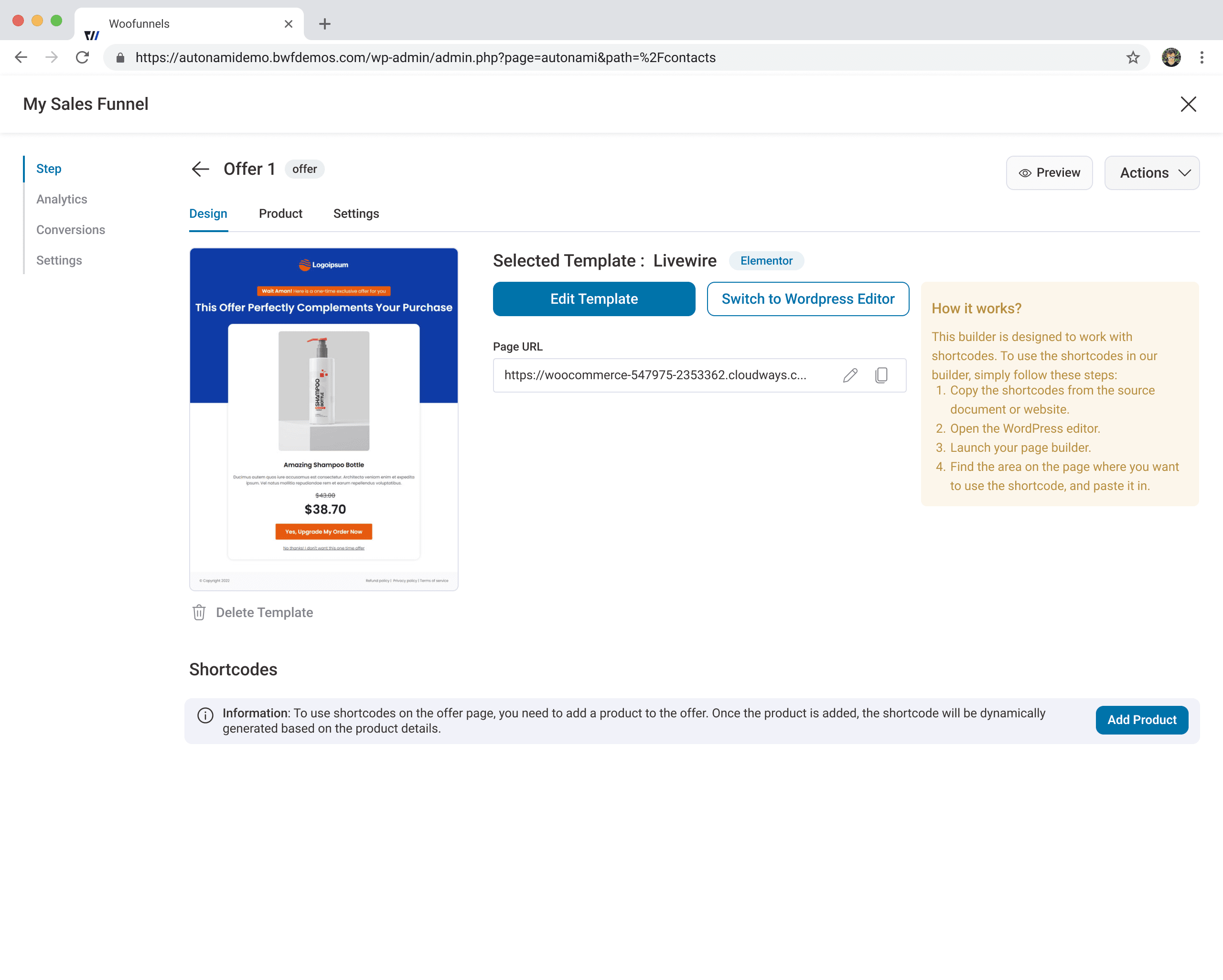
Designing the Reveal
How do you surface an offer in the gap between relief and departure?
Fullscreen takeover was attempt one. Clean hierarchy, prominent CTA. Tested with 10 customers. 8 said "pushy." 6 scanned for a skip button before even reading the offer. Anything blocking order confirmation triggered a defence response - didn't matter how well-timed it was.
Recommended for you
Defence response triggered - fullscreen feels like a threat
Embedding below order confirmation solved the aggression problem but created an invisibility one. 5 of 8 users scrolled right past it.
What worked: the thank-you page loads normally, full order confirmation visible. After 3 seconds, a card slides in from the right - doesn't block anything, spatially dismissible, consistent with notification patterns people already know. 50-user test: 31% acceptance, 94% offer visibility.
Checkout Complete
Full confirmation shown first
Transition from closing mode to validation mode
Offer Slides In
Contextual, non-intrusive
Checkout Complete
Full confirmation shown first
Transition from closing mode to validation mode
Offer Slides In
Contextual, non-intrusive
50-user test: 31% acceptance | 94% saw the offer | 0% reported annoyance
One downsell maximum. When someone declines, one lower-priced alternative. 18% of decliners accepted it. I tested two sequential downsells with 20 users - 94% declined the second, and 7 expressed annoyance without being asked about it. The trust cost exceeded the revenue. Knowing when to stop asking matters as much as knowing what to ask.
The Targeting System
Five rules, derived from co-purchase analysis cross-referenced with merchant surveys: product-specific, category-based, cart value, customer history, bundle pricing. Merchants configure through a five-question form. The conditional logic underneath is complex, but complexity should live in the system, not in the merchant's experience. That principle drove every decision. It's why setup takes 4 minutes instead of 45.
Smart Targeting
Q1
Cart value?
Q2
Product category?
Q3
Customer type?
Q4
Purchase history?
Q5
Device?
Rule Engine
IF cart > $100 AND category = yoga THEN show yoga blocks
Q1
Cart value?
Q2
Product category?
Q3
Customer type?
Q4
Purchase history?
Q5
Device?
Rule Engine
IF cart > $100 AND category = yoga THEN show yoga blocks
Downsell Logic
Show downsell
-30% price
Show downsell
-30% price
2nd downsell tested: 94% no-thanks, stopped at 1
Beta iteration over 8 weeks, 200 merchants. Weeks 1-2: "I don't know which products to offer" - added templates. Weeks 3-4: "I want to test different offers" - built A/B testing with auto-winner. Weeks 5-6: "Mobile offers feel cramped" - redesigned at 85% viewport width with larger tap targets. Each round surfaced something I couldn't have predicted from the research.
Reflections
I measured conversion but not long-term trust. My hypothesis for V2: 1-2 upsell accepts per customer probably correlates with higher lifetime value. 4+ probably correlates with churn. If that holds, the design implication is a per-customer frequency cap - not "show every eligible offer" but "protect the relationship." Good UX isn't about this transaction alone. It's about the next hundred.
Time-based scheduling wasn't an edge case. 34% of merchants asked for seasonal offer scheduling after launch. I'd classified something central as niche. User needs don't always line up with how I'd prioritize them.
Small samples need honest framing. The 30-person timing test and 50-person framing test gave directional confidence, but I presented them to the team as stronger evidence than they were. Should've built the A/B testing framework earlier so merchants could validate at real scale from the start.
“$180,000 in sales. One-click upsells generated almost $18,000, nearly 10% of profit.”
“$5,700 last month on new store. $1,000 from one-click upsells alone.”
More Projects