FunnelKit Sliding Cart
Increasing average order value by 28% without touching checkout
TL;DR
| The challenge | 40% of customers who added products to their carts were abandoning before checkout, not because of price, but because the 'View Cart' redirect broke their shopping momentum entirely. |
| My role | Product Designer - research strategy, interaction design, recommendation logic, usability testing |
| Team | 1 PM, 3 Engineers, 1 Marketing Lead |
| Timeline | 5 months, Sept 2024 - Jan 2025 |
| Concurrency | Ran alongside Sublium during Q4 2024–Q1 2025 |
| Tools | Figma, Hotjar, Amplitude, UserTesting |
The challenge
40% of customers who added products to their carts were abandoning before checkout, not because of price, but because the 'View Cart' redirect broke their shopping momentum entirely.
My role
Product Designer - research strategy, interaction design, recommendation logic, usability testing
Team
1 PM, 3 Engineers, 1 Marketing Lead
Timeline
5 months, Sept 2024 - Jan 2025
Concurrency
Ran alongside Sublium during Q4 2024–Q1 2025
Tools
Figma, Hotjar, Amplitude, UserTesting
Key Design Decisions
I tested 15 WooCommerce cart plugins. Every one tried to build a better cart page. None of them questioned whether the cart page should exist at all.
12,000 installs in 3 months. Average order value up 28%. Cart abandonment down 17 points. Fastest product adoption in company history, per internal product analytics tracking 90-day install velocity across all FunnelKit launches. Here's the story.
I had a hunch about this one early on. The company had already redesigned WooCommerce checkout for 39,000+ merchants - conversions were up. But I kept pulling at a thread upstream: 40% of customers were vanishing before they ever reached that optimised checkout. They were dropping off at the cart page itself.
The Assumption Nobody Questioned
I installed all 15 WooCommerce cart plugins I could find. Every single one took the same approach - replace the cart page with a better-looking cart page. The page stayed. The redirect stayed. The momentum break stayed.
Amazon and ASOS do it differently. Amazon's persistent cart icon keeps you one click away, no redirect. ASOS uses a slide-out cart that keeps the product page visible behind it. Both give you a middle ground between "still browsing" and "ready to buy." Nothing in the WooCommerce ecosystem offered that.
That's when I knew - we weren't building a better cart page. We were getting rid of it.
Why Customers Left
I needed the human side, not just the analytics. Recruited through exit-intent surveys on 12 merchant partner stores, targeting customers who'd abandoned within 48 hours. 25 out of 143 respondents agreed to short phone calls.
I also tagged 200 Hotjar recordings with four codes: page arrival, scroll depth, click targets, exit behaviour. The dominant pattern was almost mechanical - arrive, scroll to total, pause, leave without clicking anything.
Marcus Chen
Browse-Heavy Shopper
“I clicked 'view cart' and suddenly I was on a new page. It felt like I was committing to something.”
Goals
Frustrations
Observed Behaviors
Hotjar Pattern
Arrive → scroll to total → pause → exit without clicking
Emma Martinez
Comparison Shopper
“No product images in the cart. I couldn't remember why I'd added that item. I just removed it.”
Goals
Frustrations
Observed Behaviors
Hotjar Pattern
Open cart → mis-tap remove → close app in frustration
One quote from those calls that I keep coming back to:
"I clicked 'view cart' and suddenly I was on a new page. It felt like I was committing to something. I wanted to keep looking."
That page transition was pushing customers from browsing mode - exploratory, low stakes - into evaluation mode - deliberate, high commitment. And 40% decided they weren't ready for that shift. The cart page itself wasn't badly designed. Going to a cart page was the problem.
The redirect felt like commitment
8 of 25 participants
“I wasn't ready to commit, I just wanted to see the price”
P3, first-time visitor
“Going to a new page felt like I was buying”
P7, mobile user
“I lost my place on the product page”
P12, repeat customer
Cart stripped context
11 of 25 participants
“I couldn't remember why I added that item”
P1, browse-heavy user
“No product images in the cart”
P9, comparison shopper
“The cart felt disconnected from shopping”
P18, frequent buyer
No middle ground
6 of 25 participants
“I wanted to adjust without leaving”
P5, power user
“There's no quick peek option”
P14, casual browser
“It's all-or-nothing”
P21, returning visitor
What the Market Was Building
All 15 competitors shared the same symptoms. Every solution polished the destination without eliminating the trip. Recommendations were generic - showing "Bestsellers" to a coffee buyer is just noise. 62% of WooCommerce traffic is mobile, but most plugins were clearly designed on desktop and squeezed down - tiny tap targets, buried recommendations, too much scrolling. No progress milestones, no urgency mechanics, just static product lists.
| Product | Overlay Type | Recommendations | Urgency | Mobile |
|---|---|---|---|---|
| Plugin A | ❌Modal | ❌None | ❌None | ❌Poor |
| Plugin B | ⚠️Modal | ⚠️Basic | ⚠️Timer | ⚠️Fair |
| Plugin C | ⚠️Drawer | ❌None | ❌None | ✅Good |
| Plugin D | ⚠️Dropdown | ⚠️Basic | ❌None | ❌Poor |
| Amazon | ✅Drawer | ✅AI-powered | ✅Subtle | ✅Excellent |
| ASOS | ✅Drawer | ✅Curated | ✅Progress bar | ✅Excellent |
| FunnelKit | ✅Drawer | ✅Smart | ✅Progress + urgency | ✅Excellent |
Plugin A
Overlay
❌ModalRecs
❌NoneUrgency
❌NoneMobile
❌PoorPlugin B
Overlay
⚠️ModalRecs
⚠️BasicUrgency
⚠️TimerMobile
⚠️FairPlugin C
Overlay
⚠️DrawerRecs
❌NoneUrgency
❌NoneMobile
✅GoodPlugin D
Overlay
⚠️DropdownRecs
⚠️BasicUrgency
❌NoneMobile
❌PoorAmazon
Overlay
✅DrawerRecs
✅AI-poweredUrgency
✅SubtleMobile
✅ExcellentASOS
Overlay
✅DrawerRecs
✅CuratedUrgency
✅Progress barMobile
✅ExcellentFunnelKit
Overlay
✅DrawerRecs
✅SmartUrgency
✅Progress + urgencyMobile
✅ExcellentFinding the Right Shape
Research was clear on one thing: the cart had to live alongside the shopping experience, not replace it. The question was what form that takes.
Modal overlay was my first try. Tested with 8 users. Universal reaction: "This feels like an interruption." Modals block the page and force you to deal with them. I'd just recreated the same psychological problem in a smaller container.
Header dropdown worked okay on desktop but ate the entire viewport on mobile. Same containment failure, different shape.
The answer came from studying how native mobile OSes handle overlays - notifications, Control Centre, share sheets. Content slides in from the edge. The app stays visible behind it. You never lose where you were.
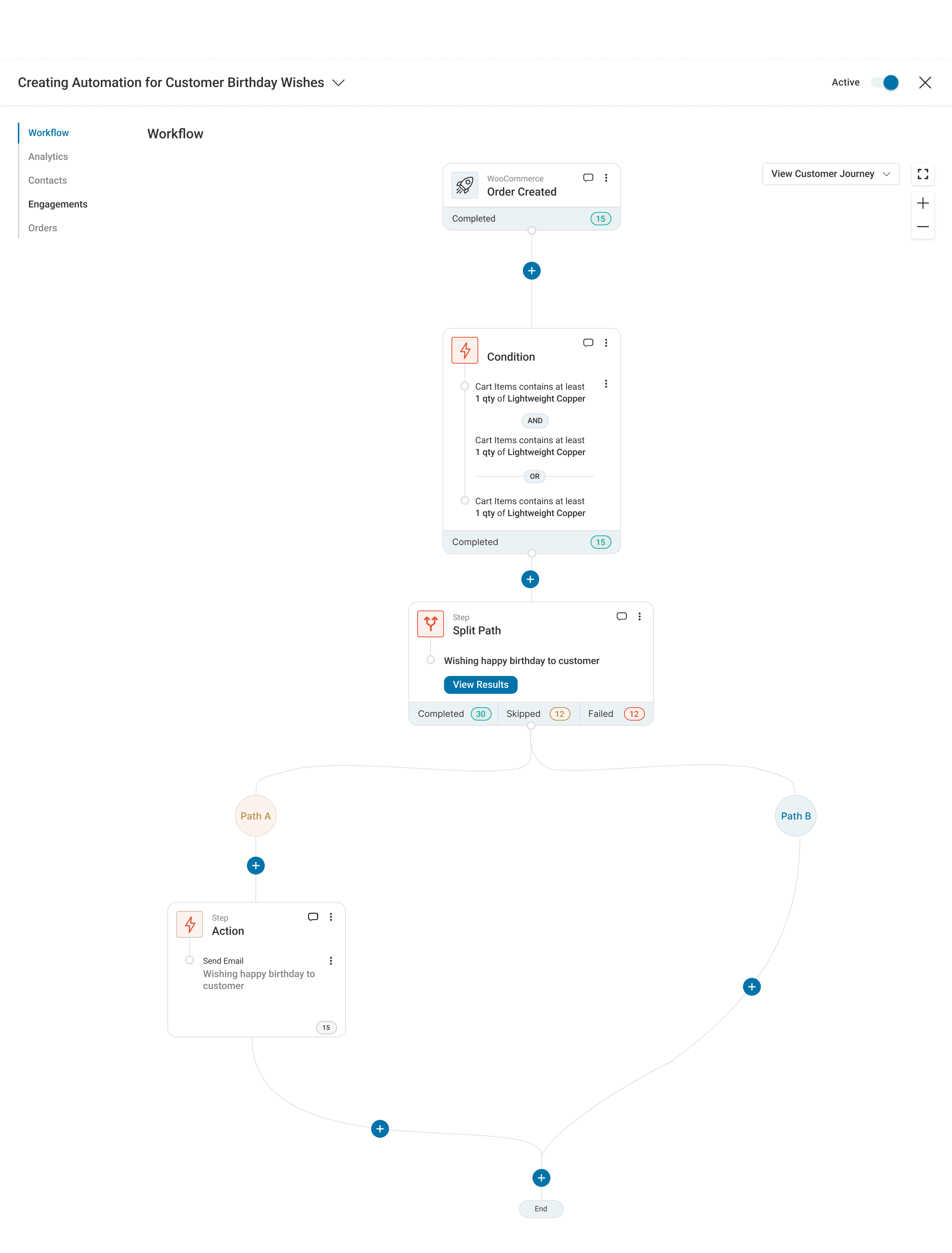
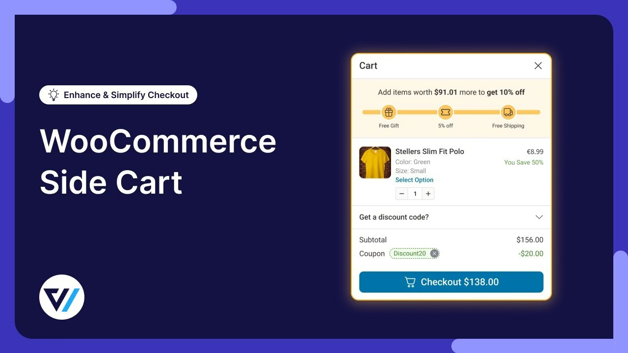
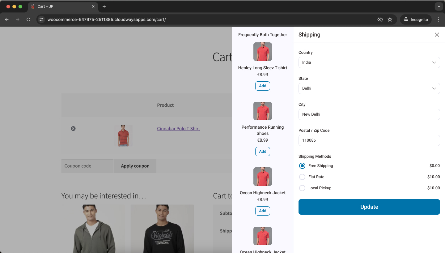
The Drawer System
Desktop: cart slides in from the right at 400px wide, product page stays visible and scrollable behind it. Mobile: 85% of screen width with a sliver of the page peeking out on the left for spatial context.
Tested with 12 users across desktop, tablet, mobile. 11 of 12 called it "smooth" or "natural." One tester said: "Oh, this is how it should always work." Post-launch numbers: 91% task success rate, median 4 seconds from cart open to first interaction.

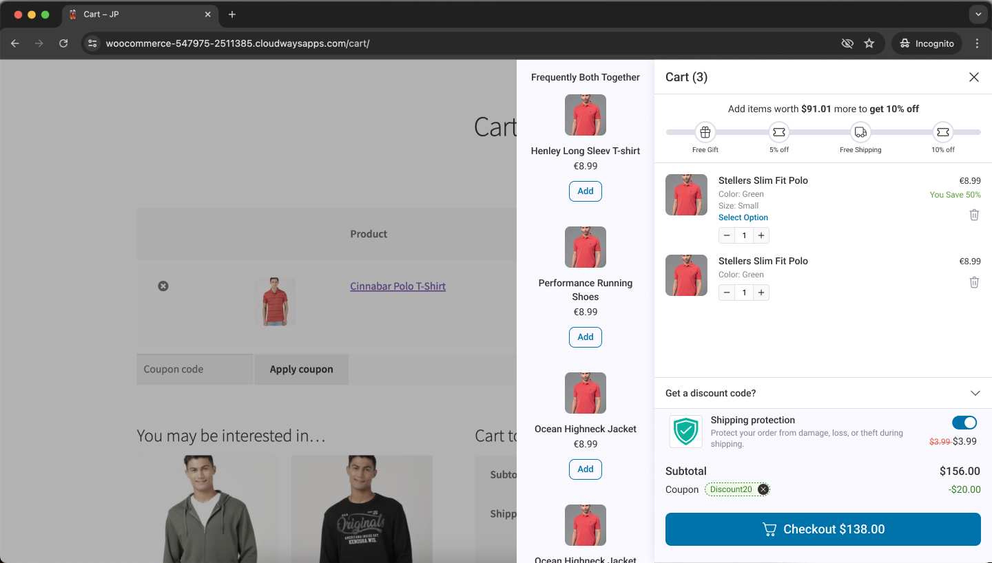
Recommendations above items, not below. 3.2x higher click rate when placed at the top. I pulled 3 months of co-purchase data from 1,200+ merchant stores and four clear rules emerged: complementary products, bundle discounts, free shipping threshold, scarcity signals. Our marketing lead validated the recommendation categories against real merchant inventories, which surfaced edge cases I'd missed - like stores with fewer than 5 products that needed a fallback. That 23% add rate in the stats comes from this work.
Progress bar with clear labelling. "Free shipping at $50" - missed by 0 users. Without the label, missed by most. Sometimes the smallest details do the most.
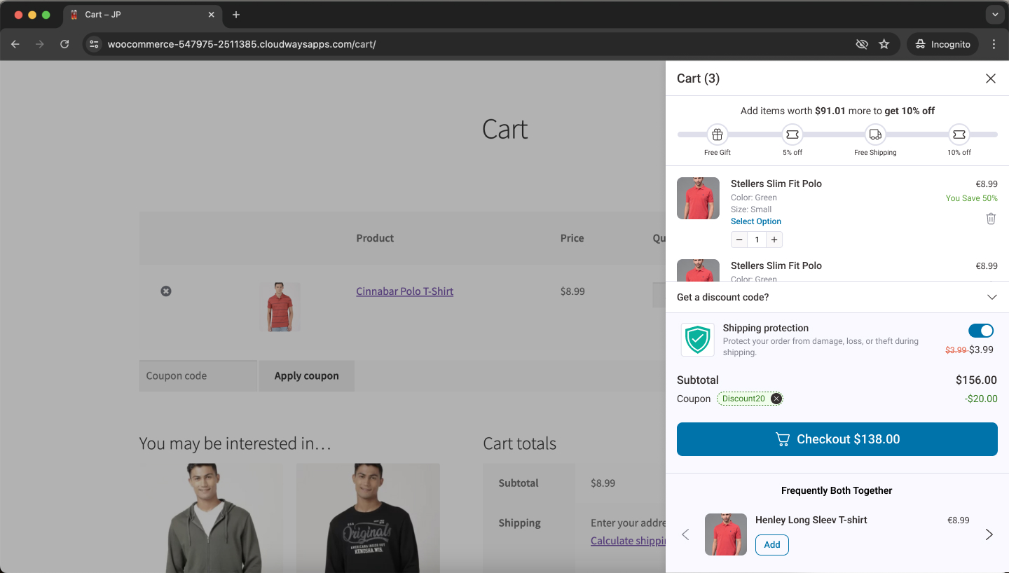
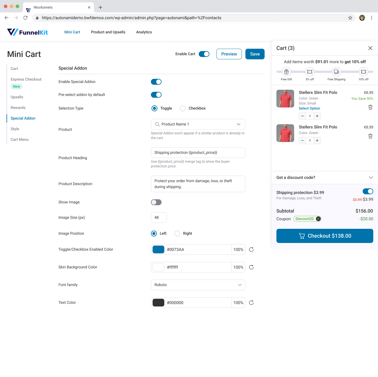
The drawer as a system. I designed the drawer as a configurable overlay with slots - header, scrollable content (sections for recommendations, add-ons, progress bar), sticky footer. This meant the same component could later power wishlists, quick-view, and account panels without rebuilding the interaction model or the accessibility layer.
3 special add-ons. Tested 1, 3, and 5 options. One felt limited. Five caused decision paralysis. Three hit the sweet spot at 23% cart add rate.
Remove with undo. A 5-second undo toast. Eliminated an entire category of support tickets and became one of the most-loved features. Tiny investment, outsized impact.
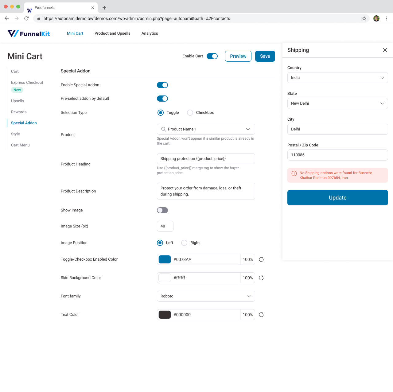
Shipping calculator. Customers were hesitating at checkout because shipping cost was a mystery. Moving the estimate into the drawer removed a late-stage surprise that had been killing conversions.
An engineering trade-off worth making. The lead engineer flagged dynamic cart updates causing full page reloads on certain themes. PM wanted to ship now, patch later. I pushed back - "A smooth experience on 80% of themes is a broken experience on 20%." We built a custom rendering engine with optimistic UI. Took two extra weeks. Zero post-launch complaints about it.
Buyer Protection
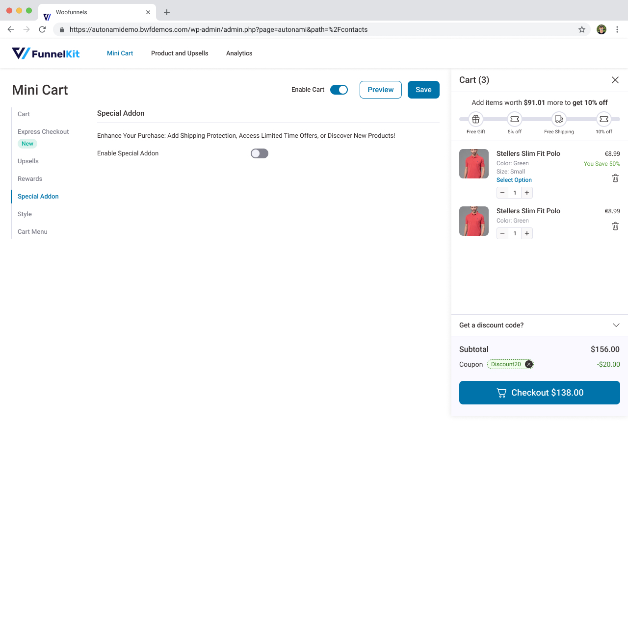
Merchants wanted optional order protection - coverage for damage, loss, or theft - offered directly in the cart. I designed two states: a clear enabled view with coverage details, and a neutral disabled state that doesn't feel like the merchant is hiding something. The goal was informed consent without pressure.
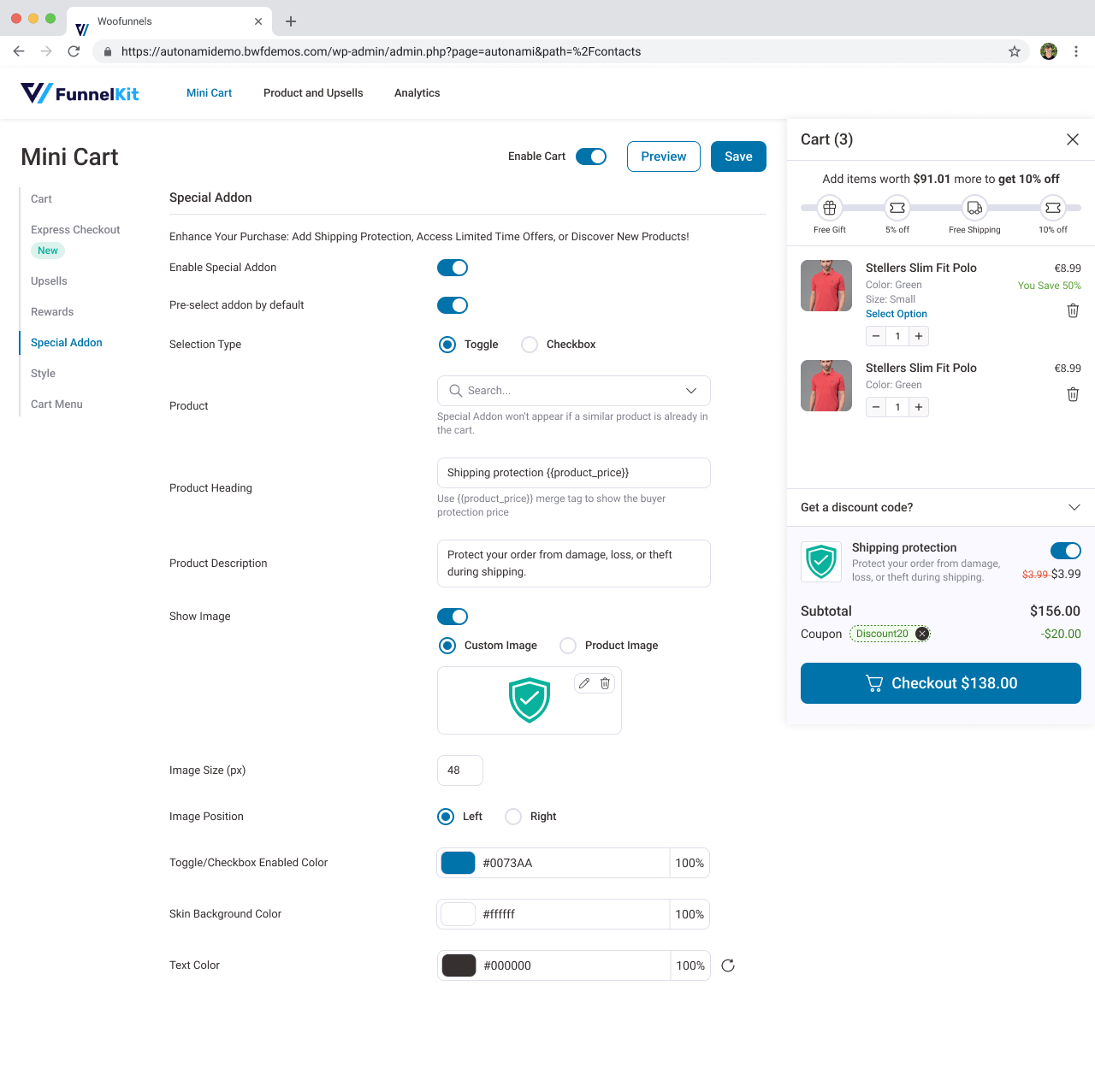
A product list view lets merchants configure eligibility per product, giving them control without leaking that complexity to customers.
Accessibility as a Design Constraint
I mapped out the full keyboard interaction model before wireframing — not as an afterthought, but as a structural constraint that shaped the drawer's architecture.
Keyboard model. Tab opens the drawer, Escape closes it, focus is trapped inside while open, and returned to the trigger element on close. Every interactive element meets 44x44px minimum touch targets.
The VoiceOver bug. During screen reader testing, I found a nasty issue — removing a cart item silently moved focus to the page behind the drawer, stranding screen reader users with no way back. The fix: an aria-live region announcing the updated cart total and item count after every change, plus auto-focusing the next item in the list after removal. That fix ended up improving things for sighted keyboard users too, who were also losing their place.
Building accessibility into the interaction model from the start meant the drawer's slot architecture (header, scrollable content, sticky footer) inherently supported assistive technology — rather than needing a retrofit.
Reflections
Smart defaults averaged two different brand voices. 45% of merchants wanted to customise copy, colour, or positioning. A fitness brand needs urgency. A luxury brand needs restraint. "One size fits all" defaults ended up feeling generic rather than helpful. I should've built personality presets.
I killed a button that 28% of mobile users needed. PM suggested a fixed sticky cart button at the bottom of the viewport. I argued visual clutter, won the debate. Then post-launch analytics showed 28% of mobile users scrolling past the header icon and having to scroll all the way back up to open their cart. I went through the session recordings, confirmed the pattern, shipped a sticky floating button in V1.2 within two weeks. Mobile cart open rate jumped 19% immediately. My "clean design" instinct had overridden actual user behaviour - and I only caught it because I was watching the data after launch.
We tested 8 themes. Merchants run 200+. 17% of initial installs had styling conflicts. Wider testing would've caught them. The real world is always messier than your test setup.
I tracked the wrong metric. Overall abandonment improved, yes. But carts under $30 were abandoning at 62% while carts over $100 abandoned at 34%. Completely different problems. I'd been optimising for the average of two distinct behaviours, and averages hide more than they reveal.
More Projects